Showing posts with label winter colours. Show all posts

Saturday, 6 December 2014

Feeling Festive with Veggiebaubles

Ooh, I haven't posted here for a little while, but I can't resist a celebration. For the December and January sketchbooks it's all about celebration. Christmas and New Year is always a good time to let the creative hair down and really go to town on a composition. 

For December I actually started with the wrong sketchbook, and before I realised, I had finished it with a Christmas design of vegetables parading themselves as Christmas baubles. All they need is the tree. Well, I must do something equally stylish for New Year and hope that the two recipients don't mind that I completed their books the wrong way round. Oops.

For Christmas we get a red onion with a raffia tie hanging from the top of the page. Seriously OTT I know, but I just loved this idea and really wanted to go for it.

Progress on the onion with the colour charts


Followed by a lovely bright red tomato. Rudolph would be green with envy.


As always, I love playing with typography, and a festive greeting was just the ticket. A little Christmas card to be enjoyed at Easter time when we finish the exchange.

The finished piece for Debbie's sketchbook


Monday, 10 March 2014

Emergence

February is supposed to be the month of romance, what with Valentine's Day appearing like clockwork on the 14th. So for this month, I decided to work on some studies of buds and emerging blooms, using passionate pinks, purples and reds.

The emergence of spring.
watercolour, pen and ink.

It has been lovely to see the camellias, early irises, hellebores and bergenias coming into bud and bloom in the garden, despite the recent shocking weather. Nature is wonderful how it just does it's own thing regardless. Starting with the typography, I mixed a rich pink using Perylene Maroon and Permanent Rose with a touch of Carmine and carefully painted the opening title.  Choosing some deliciously plump buds from a Camellia Anticipation from the garden, I kept the little study quite simple with just one prominent leaf. The acidy greens of the buds looked so pretty against the emerging pink of the petals and the rich green of the leaf. It all came together really nicely. To offset all the pink and not to go too overboard with it, I added a purple blue bud of iris reticulata.

In the garden...

Hellebores under an old tree

And more Hellebores, creating a satisfying clump.

Bergenia or 'Elephant's Ears'.
These just 'popped up'. 

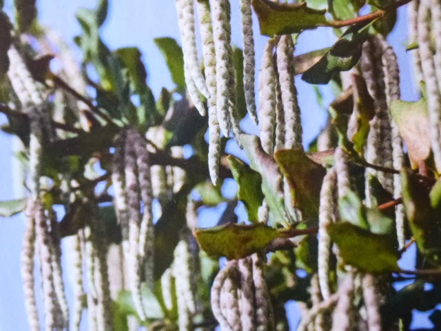
Garrya elliptica 'James Roof' 

Last year, I discovered the joys of Garrya elliptica 'James Roof'. Having never seen this unusual plant before, I was quite taken by the long dangling tassels that are actually the flowers. The Garrya is an evergreen shrub with the most gorgeous, large glossy green leaves. initially, I used a sprig (or should that be small branch) of this new delight in a mixed study last year, and having come by another piece (pinched from over the hedge up the road) it had to be done again. This time I used some pen work too, just to give the piece more a sketchbook feel.      

Just for a personal touch, I also added a couple of little studies I completed a few years ago.

Snow on a frozen pond,
and cloudspotting


Friday, 31 January 2014

Working Title

The new sketchbooks really are shaping up nicely and with so many talented contributors, I know each one is going to be a precious gem by the time we've all finished with them. It has been so interesting to see the different styles of each artist and how we approach our subjects with our own ideas. 

So, with the title page being the first thing needing some attention, I looked to the quintessential spring blooms of snowdrops to give a fresh, new start feel. Using watercolour in just a couple of washes, I found the sketchbook paper to take quite a bit of punishment with the watery mixes I tend to start with. Adding an image from an old book as a frontispiece and painting a couple of simple bee motifs into the composition added to the informal, ephemeral feel I was after.

A found image from an old book opens proceedings,
followed by my rather whimsical watercolour of snowdrops and bees  

Around the edge of the page I decided to go back to my typography days and added the group title with some calligraphy. It has been quite a while since the art pen has made an appearance, so I was a bit daunted at the prospect. Luckily the pens cover a multitude of writing sins and with just a few wobbles here and there, I am quite pleased with the finished page.

With this page dealt with it was onto the first double page. For inspiration, or just a bit of relaxed pondering, I headed towards two of my favourite published sketchbooks. In and Out of the Garden and Sketchbook from Southern France, both by Sara Midda are little works of art, (quite literally). Exquisite vignettes depicting all of life and nature sit happily beside Sara's beautiful, hand painted lettering. A lovely starting point.  


If my veg patch produced all this, I would be a happy bunny

Why don't we have signs like this in Britain?

January is a bit of a botanical drought month in our garden, especially after a battering. So, I decided to present a showcase of 'my favourite seasonal bits' from past works. Reworking has become a bit of a theme with me just now and I really enjoyed the little wallow in nostalgia as I headed back in time, with a mix of happy memories flooding back. Taking little pieces from my 'working' sketchbook and mixing with bits from finished works, I hoped to reflect something of the Primary School nature table, which I used to love. Even today, I am still quite chuffed to have been the one to bring in a tuft of sheep's wool for Teacher. (well. we were in a suburb of London, so goodness knows how it got into our school hedge!)


Hazel, Prunus berries, rose hips and snowberry

And in true over the top whimsy, (I was on a roll) a little painted vignette, this time on a small envelope will welcome my fellow 'Nature Trailers' to my sketchbook. Although, they'll have to wait to see what's in it, (I haven't finished it yet).

A window of opportunity and a cheery welcome


Friday, 24 January 2014

January Colours

Yes it does.... It took a long time (over a month) before I finally got my sketchbook from Jackson's. But when I got it I was over the moon. The Stillman & Birn book is really nice looking and the paper feels wonderfully smooth and is white. That's important for me. I hate creamy coloured watercolour paper. This is good and it will show all the colours I paint and draw in the way I want them to be shown.
So I started straight away with the title page. No problem, that was just a matter of grabbing my bookbinder glue and stick my Ex Libris in the front. I had a month to wait for the sketchbook and used that time to come up with a nice title page image. It's one of my favourite birds, the long tailed tit. They are such happy little birds and I get them a lot in my garden.


The only thing I had to work on is the lettering. I haven't written enough lately and it shows in the handwriting. Ah well... the bird was nice ;)

After that it was time to make the first two pages. I thought a lot about it and looked for inspiration on the Internet. I decided to just start with what I had in my garden. It's January and one would think that there's not much going on in nature. Wrong!!! If you look well around you there's a lot going on right now. I first cut off a twig of my Hazel. They started to colour in December and are now slowly opening up. I picked a twig with male and female catkins. It's so nice how you can see them so clearly on the Hazel.

I recently got a few new watercolours and found out that the Cinnabar Green Light Extra from Old Holland matched the male catkins beautifully. In my collection of Italian watercolours from Zecchi (in Florence) were two other colours that came very close to the hues I needed: Magenta Lake and Venetian Yellow. To finish that page I added two hazelnuts from last Autumn in coloured pencil.

On the second page I made a drawing of my flowering Prunus autumnalis. That tree is the best tree a person can have in their garden. It starts flowering after the first frost and continues to do so all winter and the start of spring. The leaves are very bright green and small, filtering the light in the summer so nicely. In autumn the leaves change colour to happy yellow and orange colours. What else do you want? Again the Magenta and Cinnabar green were most useful for this twig.
Finally I found a flowering Viburnum bush close to my house. The scent is heavenly and again I could use the soft pinks. And what else did it need? A little something to balance it all. Last year I found a small feather of a Goldfinch in our garden. Treasures like that you just have to pick up. Now is the time to share this little feather with others.

Now, about the paper.... did I like it? Yes! It is not Fabriano 5 of course but it's very nice for a sketchbook. I did some lettering in wet ink. The ink didn't bleed and feather and even the small puddles of ink didn't get through to the other side of the paper. I normally work quite dry in watercolour, especially with smaller subjects. So for me the sizing of the paper wasn't too much to handle. I imagine that if I would like to work more wet in wet, I absolutely would get a problem. But I don't, so never mind about that. For coloured pencils it's nice too although I prefer paper that allows a few more layers. But again, this is a sketchbook and not paper to make a masterpiece on. So you won't hear me complain about it.
A shame we can't buy the sketchbooks in the Netherlands but I'm happy the Golden Boy has sent me his spare sketchbook as a gift. It means more sketch fun for me ;)

~ Sigrid Frensen ~


Saturday, 18 January 2014

Time to Begin

At last it was time to begin my sketchbook. I decided to cover my book and found some handmade paper from a company called wildpaper.co.uk. They had just what I was looking for, natural paper with fern prints. After covering the book I then worked on the title page with simple sketches and writing in pen. I tried to echo the lines of the fern shapes with the writing but kept it all pretty simple.


Then what to do for the first double page spread. Hmmm. I wanted to keep it seasonal so my theme for
January was winter birches, one of my favourite trees. I went out to my local woods with my old sketchbooks and drew the trees,with pen and wash and then sketched the mosses and lichens that are found on the birch bark. The weather has been so wet and dismal that I sat in my car in the car park of the woodland and sketched! Got to keep the pages (and myself) dry!! Armed with plenty of sketches I went home and drew them up neatly in the new book.


I wanted to add some words or poetry so I made up an acrostic poem using the word BIRCH, great fun.
These sketches are actually a bit unusual for me,so neat and tidy. My normal sketchbooks are a real mess, with terrible writing and quite scruffy! But the thought of other artists looking closely at your work is enough to make you tidy it up!


The books themselves are great to work with; having very thick paper that took my washes and pen without showing through. The surface is smooth so perfect for showing up detail.

It is thrilling to be a part of this venture and to share it with such lovely people. Although the thought of drawing in another's book is quite daunting at times. But it will be a challenge and I hope my contributions will live up to expectations and most of all, will be enjoyed.        

Friday, 17 January 2014

Mighty Oaks from Little Acorns Grow

"Draw everywhere and all the time. An artist is a sketchbook with a person attached.
Irwin Greenberg

My sketchbook arrived just before Christmas, sleek, clean and full of promise. I had so many other things to do at the time, but those beautiful white pages kept tempting me. Ever since this project was conceived, I have had the phrase “Mighty Oaks from Little Acorns Grow” in my head and I really wanted to include that somewhere in my sketchbook.
I decided that I’d also like to do something on the cover of my book in gold leaf. I lost several hours looking at vintage book covers online… so inspiring! I really loved these ones, although they were perhaps a little too ambitious for me.

Beautiful vintage book covers.

In the end, I decided to do a simple golden acorn on the cover.


For the title page I took a previous sketch of an acorn and leaf and modified it.

A sketch from last September

An envelope from Egypt, printed to look like papyrus fitted perfectly as an endpaper. I’ll be writing my address onto that too, just in case the book goes astray. Fingers crossed, none of the sketchbooks will be lost!
The double spread was a bit daunting, perhaps because that first sketch will set the tone for the book. I decided to let nature be my muse and headed out on a beautiful crisp winter morning to a nearby woods. I wasn’t quite sure what I would find, but once you start to look, you begin to notice all the subtle colours of winter, and the tiny signs of new life that are appearing all around.

"If one really loves nature, one can find beauty everywhere. "
Vincent van Gogh


 I’m going to try and use this project to learn more about the natural world around me. I’m delighted to say that the paper also lived up to my expectations … it didn’t buckle and took the paint very well.

Beech tree buds are quite beautiful up close 

But most of all, I’m feeling very excited to be involved with such a creative and supportive group of people. Their enthusiasm and encouragement is contagious!  It’s wonderful to start the year on such a positive note. 
Great things lie ahead.